Saturday, June 17, 2006

Seasonal Update - Summer


Our decidedly campy seasonal headline graphic has been updated for summer. For some summer kitsch, lettuce visit www.bonfx.com together

Thursday, June 08, 2006

Sculpt - Personal Training & Online Fitness Store


Hot off the presses...We've completed a marketing site and an online store for Sculpt, LLC. The marketing site was completed first, and set to the tone for the store. The store, like all good stores, need a bright and clean interface. We took the darker, richer, and more personal look and feel of www.sculptfit.net and derived a whiter, more open, and more public look for the www.sculptstore.com. The branding carries over consistently to meet the needs of two very different kinds of website visitors.

Art vs. Technology


Explaining really technical things to people with an ear for technical details is hard. Explaining really technical things to people without an ear for technical details is, well, really hard. Not that all artists can't understand technical details, but we tried to make explaining an integrated eCommerce and Content Management System as simple as possible. I'm an artist, so I'm allowed to say that.

Hi-tech, Lo-cost


Here, our client needed to convey a sense of clarity, simplicity & hi-technology, while looking cost efficient and no-nonsense. The logo was previously developed in use world-wide, so we also had to design around the existing branding.

Asian Flare


Corporate, yet Asian. Sophisticated, yet friendly. Those are hard words to put in one sentence, nevermind in a design. But, both us and the client like what we ended up with!

Saturday, February 04, 2006

Revolution Group: New Website


Another site launch: we've been, how do you say, "busy"?

Next up is Revolution Group's new website. We previously developed a logo and branding for Revolution Group, and followed up with a website derived from that work. Our mission here, as with the logo, was to reflect the maturity and sophistication of Revolution Group. A decade in the technology sector is a long time, so we wanted to reflect that in the choice of colors and by means of a clear, well-focused layout and message. Their products and services are very "ease-of-use" oriented, so we also wanted the website to communicate that very thoughtfully.

We took a classic typographical approach to the content areas of the site, and were gladdended by what we could do with HTML and CSS to achieve the desired result with pixel-precision across the major browsers.

Lumasense: New Website


BonFX is glad to announce the arrival of the new Lumasense website. We previously developed the logo and branding for Lumasense, and have now launched the website to compliment that work. The website mission was two-fold: create a site that displayed both the incredible color possibilities of digitially-contolled LED lighting (over 16 million colors), while at the same time communicating the simplicity and robustness inherent in LED technology. We feel we struck the right balance. No rainbows or lightbulbs here! Instead, we have a fresh, bold design statement that integrates well with the freshness and boldness of LED color lighting technology. If you are interested in reading more about LED technology and where it's headed, read some more here. You can also browse a listing of public LED installations here.

Thursday, January 05, 2006

Revolution Group: New Logo


We've been busy with branding these days. Revolution Group asked us to revamp their brand to incorporate a sense of movement, yet retain the simplicity, clarity and balance a company of their maturity and knowledge should convey. The branding established in the new logo and corporate identity is following in a forthcoming website...

Lumasense: New Logo


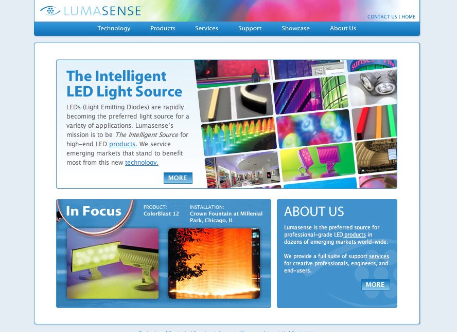
Lumasense is an LED technology solutions company. LEDs are set to make the light-bulb obsolete in the coming decade. Lumasense is driving the adoption of LED technology by providing lighting solutions for a wide variety of architectural and retail applications. Their website is forthcoming.

Their logo represents the eye as the sensory organ for light, but also the LED components themselves as the iris. LED technology also makes excellent "sense" for illumination in the 21st century.

Finally, one of the most incredible aspects of LED technology is that it can be competely controlled, like a computer application, for the creation of millions of colors in real time. It can blend, transition, and animate on-the-fly. The logo represents the dynamic nature of the movement of color, from one to the next. Keep your eye on LED technology - you will see it everywhere before too long.