Here we have a quick little before and after scenario. Storm wanted a rebranding effort, but was very attached to their old logo. We took the logo under our wing, as it were, and taught it to fly a little higher. Forthcoming is a whole new website into which the refreshed logo will nest nicely. This project is the direct client of Strategic Advantage, a web technology company.
Tuesday, October 25, 2005
Flying Higher
Here we have a quick little before and after scenario. Storm wanted a rebranding effort, but was very attached to their old logo. We took the logo under our wing, as it were, and taught it to fly a little higher. Forthcoming is a whole new website into which the refreshed logo will nest nicely. This project is the direct client of Strategic Advantage, a web technology company.
Wednesday, October 19, 2005
Rusty old stuff
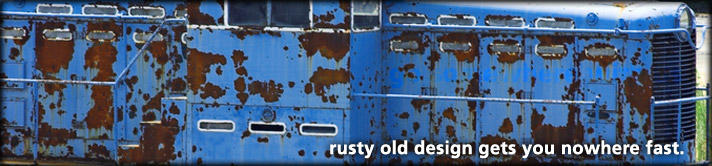
"It looks so old and dated now..." is something we hear from clients a lot as they examine their own marketing material, sales collateral, web pages, etc. We heartily will agree, if it's true. Sometimes there is a gem of an idea that is considered old, but perhaps it never got polished. We'll go to bat for a great idea that never got a fair chance. But many times, we just sit with our clients in the moment of realization, and just nod slowly in agreement. And then get to work!
Tuesday, October 11, 2005
BonFX: New shoes have arrived!

While it isn't quite perfect yet (there are a few CSS tweaks needed for a few Safari issues), it's done and out there: freelance.bonfx.com. Our homepage has been basically the same (nothing much) for about five years. I've been cobbling the shoes of others in the interim. This was way overdue!
Sunday, October 09, 2005
Text anomaly: "sine wave"?
This is an interesting "right ragged" text anomaly I noticed while typesetting part of a new design. In all my years of setting type, I would have to say that I never noticed a "sine wave" or anything else so complete in terms of an indentifiable shape in a very finite block of text. Unless you set type, you might not get to excited but consider:
- The text reads perfectly (it wasn't massaged to make this happen)
- It's just sitting in a box and it a complete thought
- Completely un-premeditated (is that word?)
Friday, October 07, 2005
TCS: Notecard with a light touch

This is the cover for a notecard we are designing for TCS Software. TCS wanted something to be able to send out to clients and potential clients that reflected the mature status of their proprietary software platform, with a light touch, while remaining within the fold of their new branding, which we executed recently. See the "Granny Ad" entry from earlier.
Thursday, October 06, 2005
ZoomInfo: Email Blast for Webinars
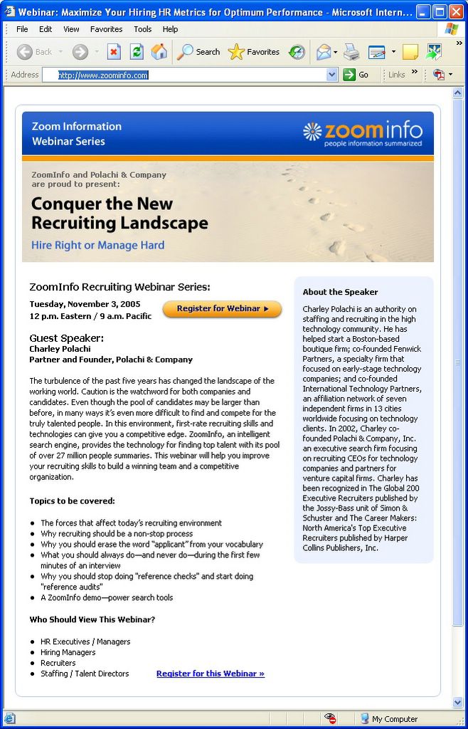
Here is the latest example of some of the opt-in email blasts we've been creating for ZoomInfo's Webinars. This is a standard HTML document with images hosted on the senders (or a third party's) servers. These types of campaigns to promote webinars have been extremely successfull for ZoomInfo, so they keep asking us to help them. That works nicely for both of us.
BonFX - New shoes for the cobbler's kids, finally.
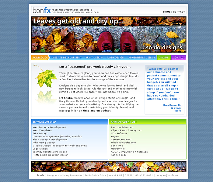
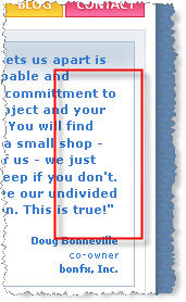
Well, here is a sneak peak at the "new shoes", no pun intended (see the picture up close). Click, and you'll be able to read about our revamped freelance design studio services and offerings. The idea here is that we are going to change the "ad campaign" style graphics and related elements along with copy at the change of each season. Fresh content, as we have learned, really is "king." So don't forget to grab the XML feed on this blog if you want to be notified when the new site launches, and we make the next seasons change in December. Borrowing a lead from Google, we will also include "micro" changes to the site branding inbetween seasons.
>> posted by bonfx.com
Saturday, September 17, 2005
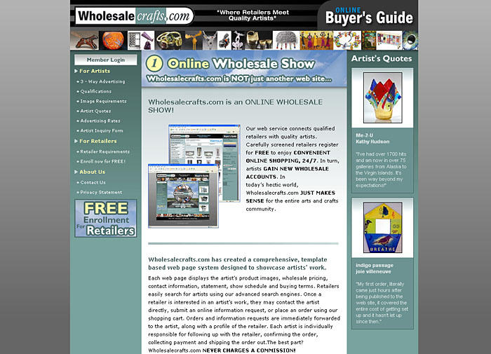
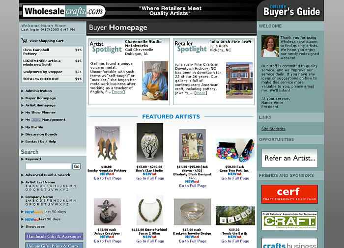
WholesaleCrafts.com: new site launch
New Wholesalecrafts.com launches! We've worked with Wholesalecrafts since day one, which was eight years ago in 1997. Truly, they are a dot.com baby that made it. This redesign is the largest one yet, which encompasses every aspect of this huge site. We are glad to show it off. In addition to a few exterior shots, we have a few "insider" pics you can't see while visiting the site at www.wholesalecrafts.com


Kanaan Group: final logo

Kanaan Group went with a polished version of one of the earlier prototypes (from here). Our process came up with about a half dozen distinct directions based on a "K" and "G" with green theme. This final logo with the merged "KG" suggests innovation and integration.
>> posted by bonfx.com
Wednesday, August 24, 2005
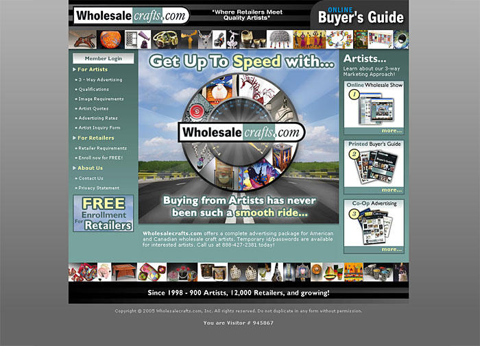
WholesaleCrafts.com: advertisement

Here we have the final ad for the backcover of WholesaleCrafts.com Fall 2005 mailer. This is going out to 40,000 Subscribers of Niche Magazine. The concept the owner wanted to convey was one of "revolution", in regards to how wholesale artists find buyers. This is the third major incarnation of the WholesaleCrafts.com website, started in 1997. "Revolution" got us thinking about wheels, and then the idea of "speed" - in regards to buyers and artists finding eachother - came out as the winning concept. The orginal concept comp is here.
>> posted by bonfx.com
Monday, August 15, 2005
TCS Software: "Granny" ad

TCS Software needed an ad that matched their new corporate identity that we just rolled out. It had to be delivered to an audience using Powerpoint, but also be the basis for an ad campaign by postcard and also a newsletter. With TCS as the "sun" shining down on the green foliage where the headline is, the apple seemed fitting. We borrowed the idea from a similar theme on the TCS Software training page.
Kanaan Group: logo design process
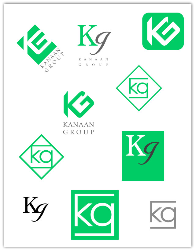
This is a little peek into our design process - in this case a logo design. Kanaan Group wanted to keep their green and the use of K and G as prominent design features. Our approach is to present an impression of possibilities to ellicit an emotional response. We gather that feedback as unfiltered as possible and incorporate it into the next round of design. Which one will they go for? Stay tuned...
Posted by Picasa
Mad Creative: website design
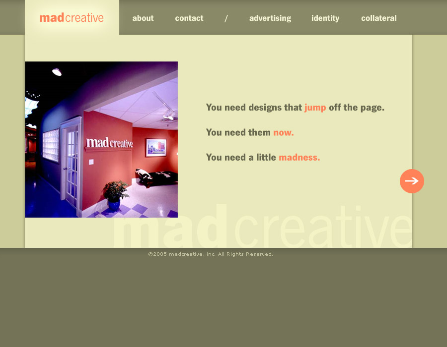
Here is the final approved design for a colleague's site. Ah, the cobbler's shoes. Now I need to find someone to do my site, or maybe my other site...Mad Creative is a small advertising agency par excellence focused on traditional media.
Posted by Picasa
TCS Software: extranet website design

CareSource: web site
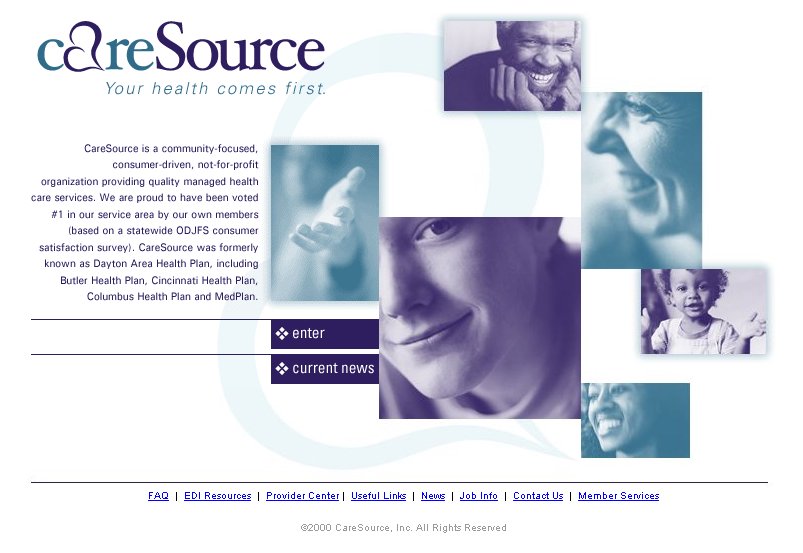
This was an interesting job. I was given all the assets in a folder and told I had to match a billboard using the same graphics, but I couldn't see the billboard until after the site launched. Nice problem. So I asked a lot of questions and deduced a graphic solution that ended up working very well.
Posted by Picasa
Ohio Chemistry Council: web site

This site is part of a content management system designed specifically for the managing of associations. TCS Software provides the backend functionality for all aspects of the web content, and in this case, I provided a template. Each template designed for the TCS Association Web Suite is unique in all respects, so design is not constrained by a cookie cutter.
Posted by Picasa
TCS Software: website design

This is the final design for the new TCS Software website. TCS has several products to offer prospective clients, but they had a need to eliminate confusion due to the fact that the products overlap. We devised an "action" based metaphor for the home page, and then applied a subsequent color branding amonng the software solutions to reinforce the unique indentity of each application. Check out the live site here.
Here is one example of an interior page branded with the color scheme from the home page.

Posted by Picasa
westsideARTS: website design

Here is the final design comp for the westsideARTS organization on the west side of Providence, RI. This design is the basis for a Mambo content management solution website that will manage all the live events that WSA hosts at the historic Columbus Theatre in Providence, RI.
Posted by Picasa
Rhode Island Internation Film Festival (RIIFF): website design

This is the approved design for the Rhode Island International Film Festival's new website. You can see it live at RIIFF.org. The director had the colors of old Russian and Soviet era political posters in mind. I dropped in the little snippet that I worked from. The design inspiration was the Siskel Film Center website.
Posted by Picasa
ZoomInfo: banner advertisement

Another newlsetter ad for ZoomInfo. This ad was embedded in an email newsletter sent out to opt-in recipients of the recruiting industry.
I keep finding more and more reasons to like iStockPhoto.com. The quality of stock images, like the magnifying glass above (heavily edited from the source though it is), along with the great image search tools and price are just unbeatable. This has to make PhotoDisc kind of irritated.
Posted by Picasa
Sunday, August 14, 2005
Kanaan Group: photoshop editing
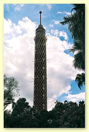
This is the shot we started with of the tower in Cairo for the Kanaan Group. Somebody got it off the internet.
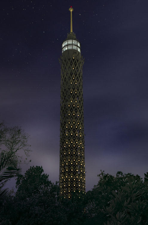
This is the same shot a little while later after turning day to night, and adding LED lighting simulations.
Tuesday, July 19, 2005
Wholesalecrafts.com

Concept for Wholesalecrafts.com. The idea here is that Wholesalecrafts.com is the fastest way for Artists and Buyers to find eachother, and streamline the entire process of provisioning handmade crafts to be sold in the typical boutique art gallery and gift shop.
TCS Software: Windows XP Icon set

Here's a quick screen grab of a Windows XP style icon for TCS Software's Prevail. Prevail is their flagship product that manages all aspects of running an association. They are branding their latest release to coincide with the branding we did for their websites, tcssoftware.com and tcslabs.com
bonfx.com
Subscribe to:
Posts (Atom)